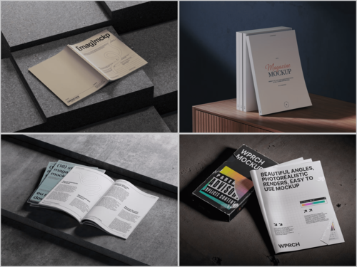
Scrolling through Instagram, TikTok, or Pinterest is a full-time job for most thumbs, and a flat product photo rarely earns half a second of attention. What earns a pause is context — a glossy cover, a coffee cup, reading glasses resting on an open spread. That’s the quiet power of a Magazine mockup: it turns a design file into a scene people recognize from real life, and recognizable scenes get more taps, saves, and shares across every feed.
Why Print Still Wins Attention Online
It sounds backwards, but content that looks physical often performs better online. Instagram and Facebook feeds are saturated with flat graphics and template quotes, so a textured, three-dimensional page stands out by being different. On Pinterest, where people search “magazine cover ideas” and “editorial layout” boards, a staged photo also gets re-pinned far more than a plain PDF export.
1. Turn a Cover Reveal Into an Event
Launching a new issue is a milestone worth dramatizing, and the format changes by platform. On Instagram, a countdown built from three or four Stories — silhouette, close-up, full reveal — keeps followers checking back before the cover goes live in the feed. On TikTok, the same mockup becomes a five-second reveal clip, with the cover “unboxed” from a stack of older issues. Placing the design inside a realistic scene photographs the product the way it will look once printed.
2. Build a Consistent Carousel Format on Instagram and LinkedIn
Carousels reward repetition, and they’re the native format on both Instagram and LinkedIn. Followers learn to expect a certain rhythm, and that familiarity keeps them swiping. A simple formula works well:
- Slide 1: cover shot in a styled scene
- Slide 2–3: interior spreads shown flat or fanned open
- Slide 4: a close crop highlighting one headline or photo
- Slide 5: a call-to-action frame with a subscribe link or store tag
Because the same mockup template can be reused with new artwork every issue, this format is fast to produce and instantly recognizable as “that magazine’s post” — whether it lands in an Instagram feed or a LinkedIn company page update aimed at industry readers.
3. Repurpose One Design for Every Platform
A single layout rarely fits every network’s dimensions. Square for Instagram, vertical for Stories, wide for X and Facebook link previews — resizing a flat PDF for each often looks stretched or cropped. Placing the design into a scene first solves this, since background and framing adjust per platform while the magazine stays sharp. Studios like ls.graphics build scenes with this flexibility in mind, so one template can serve months of content instead of a single post.
4. Show the Product in Someone’s Hands on Pinterest and Instagram Reels
Lifestyle framing implies use in a way a plain white background can’t. A mockup showing pages being flipped, a magazine on a desk beside a laptop, or a stack on a coffee table next to a mug tells a small story about when the content fits into someone’s day. This is exactly the kind of image Pinterest boards are built around, and it works just as well as a static frame inside an Instagram Reel. Fashion and lifestyle titles use this angle in paid ads and organic posts because it mirrors “in the wild” photography, without booking a shoot for every issue.
5. Turn Press Mentions Into Visual Proof on LinkedIn and X
A screenshot of a press mention rarely does justice to the moment. Wrapping it in a magazine mockup and posting it as “as featured in” content adds credibility a plain quote card can’t match. On LinkedIn this reads as a company milestone; on X (Twitter) it works as a quick reply-bait post. Agencies and freelance publicists reuse this trick for client reporting and social proof.
Real-World Examples Worth Noting
This isn’t a hypothetical technique — small and independent publishers already lean on it heavily:
- Independent zines with limited print runs can’t afford lifestyle photoshoots for every release, so mockups give their Instagram previews the same polish as a major publisher’s marketing.
- Freelance designers building portfolio case studies present client layouts inside realistic scenes rather than flat pages, since clients judge presentation as much as content.
- PR teams running “as seen in” campaigns wrap press clippings in printed-page mockups before sharing them on LinkedIn and X, since a styled image travels further than a plain screenshot.
- Self-publishing platforms suggest mockup previews to authors because product pages with staged imagery convert better than raw file exports.
The Bottom Line
Reach isn’t only about posting more — it’s about giving each post a reason to be noticed, saved, or shared. Magazine mockups are a low-cost way to add that reason: they make digital work look tangible and trustworthy on whichever feed it lands in. Pair a strong layout with the right staged scene, keep the format consistent across your content calendar, and even a small publication can hold its own against outlets with full production budgets.